Horizontal galleries in Power Apps usually force every item to have the same TemplateSize. This can feel restrictive, especially when you want a more dynamic look — like breadcrumbs or tags that adjust to their text content.
Recently, community member jafrra shared an outstanding approach for dealing with this issue by creating a component. So here is a step by step guide on how to build this component.
💡 The challenge
By default, all items in a horizontal gallery have a fixed width. If your text is short, you end up with wasted space; if it’s long, it might wrap or get cut off.
With a breadcrumb-style navigation, we want each item to “fit” the text precisely and flow naturally.
🏗️ Step 1: Create an Items input property in your component
Before adding any gallery or logic, start by making your component reusable and data-driven.
Steps
1️⃣ In your component editor, select Custom properties.
2️⃣ Click + New custom property.
3️⃣ Set:
- Name:
Items - Property type: Input
- Data type: Table
- Description: “Breadcrumb items or dynamic data”
4️⃣ Save the property.
When you later drop this component onto a screen, you can pass any table or collection into this Items property.
🖼️ Step 2: Add a horizontal gallery
- Insert a horizontal gallery into the component.
- Set
Itemsto:
cmpFlexibleWidthGallery.Items
- Set
TemplateSizeto0so each item can have custom sizing.
🧾 Step 3: Define your data source (outside the component)
For testing, create a collection like:
ClearCollect(
    colBreadcrumbs,
    [
        { Id: 1, Name: "Home", Order: 1 },
        { Id: 2, Name: "Settings", Order: 2 },
        { Id: 3, Name: "Accounts", Order: 3 },
        ...
    ]
)
Then set your component’s Items property to colBreadcrumbs.
🔎 Step 4: Measure each item’s text width
Add an HTML Text control inside the gallery item
Why?
We can’t measure text width directly, but we can measure an HTML container rotated by 90°, and then read its .Height property (which acts as width after rotation).
Steps:
1️⃣ Insert an HTML Text control (name it, e.g., htmWidthCalc).
2️⃣ Set HtmlText property to:
"<div style='white-space: nowrap; transform: rotate(90deg);'>"
& "<span>"
& ThisItem.Name
& "</span></div>"
3️⃣ Set AutoHeight to true.
4️⃣ Set Y to Parent.Height-Self.Height-60 (this prevents it from affecting the vertical layout visually).
Important: Match font and size
In your HTML labels, make sure you set the font and font size properties properly:
Font: =btnNavigationCrumbs.Font
Size: =btnNavigationCrumbs.Size
If you skip this step, you may get incorrect measurements, leading to cut-off text or overlaps.
➡️ Step 3: Calculate X offset for each item
Add a second HTML Text control
Why?
This control “renders” all the text of the items that come before the current one, so you can calculate the cumulative width and use it as your X offset.
Steps:
1️⃣ Insert a second HTML Text control (e.g., htmXCalc).
2️⃣ Set HtmlText property to:
"<div style='white-space: nowrap; transform: rotate(90deg);'>"
& Concat(
    Filter(
        cmpFlexibleWidthGallery.Items,
        Order < ThisItem.Order
    ) As CurrentItem,
    CurrentItem.Name
)
& "</div>"
3️⃣ Set AutoHeight to true and Y to Parent.Height-Self.Height-60
4️⃣ Match font and size exactly as before:
Font: =btnNavigationCrumbs.Font
Size: =btnNavigationCrumbs.Size
⚖️ Step 4: Adjust for border and padding
Power Apps renders borders half inside and half outside control bounds, which can shift your layout slightly.
Adjust by putting the following in the padding bottom property of the xcalc label:
((ThisItem.Order-1) * btnNavigationCrumbs.PaddingRight) + ((ThisItem.Order-1) * btnNavigationCrumbs.FocusedBorderThickness)

and this in the paddinng top property of that same label:

((ThisItem.Order-1) * btnNavigationCrumbs.PaddingLeft) + ((ThisItem.Order-1) * btnNavigationCrumbs.FocusedBorderThickness) - btnNavigationCrumbs.FocusedBorderThickness
🟢 Step 5: Add your final visible button
Insert a Button control (e.g., btnNavigationCrumbs)
Key properties:
- Text:
ThisItem.Name
- Width:
htmWidthCalc.Height
- X:
htmXCalc.Height + ThisItem.Order * 6
The Order * 6 piece fine-tunes horizontal spacing to handle padding and borders consistently.
✅ Final result
With these steps:
You achieve a breadcrumb or tags-like component that feels much better than empty space or overlapping text.
Each button exactly fits its text.
Buttons align horizontally without gaps or overlaps.
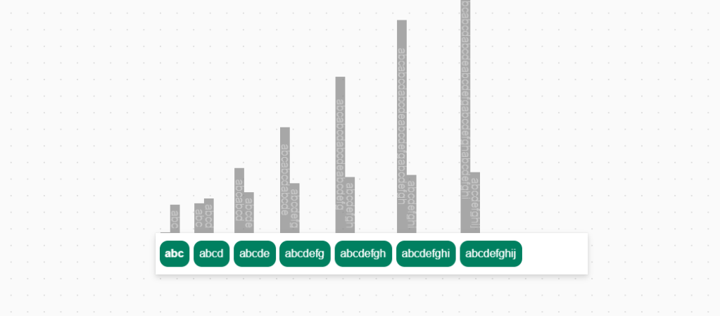
When you component is built it should look something like this in the editor:
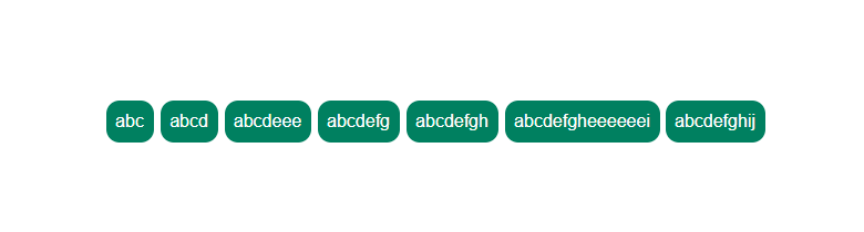
The finished product when played….a polished gallery that doesn’t have empty white space:


 Power Nerd Insights - Power Platform Tips and Tricks
Leave a comment